 |
|
2015-05-04
, 15:48
|
|
Posts: 67 |
Thanked: 64 times |
Joined on Feb 2015
@ Argentina
|
#761
|
Originally Posted by BlazingBird

Thats would be quite nice of you.-

|
|
2015-05-04
, 16:33
|
|
Posts: 180 |
Thanked: 180 times |
Joined on Nov 2014
@ New Delhi, DELHI, INDIA
|
#762
|
I guess we should put up a vote. Though, imo the blue one is subtle. this one is fine for my eyes.
|
|
2015-05-04
, 16:44
|
|
Posts: 197 |
Thanked: 145 times |
Joined on Dec 2011
@ Dubai, U.A.E.
|
#763
|
Now what about the NEW modifications we can do in the main UI.. Here are some suggestions guys:
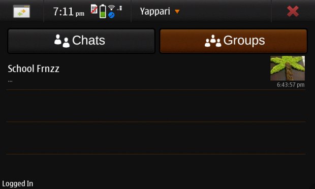
1. For the Main page I was thinking we could split it into two. As I feel the scrolling is very laggy sometimes. When you have too many groups and chats. And if we could change the layout of the time on the right side, under the image. The image will be a 1:1 square.
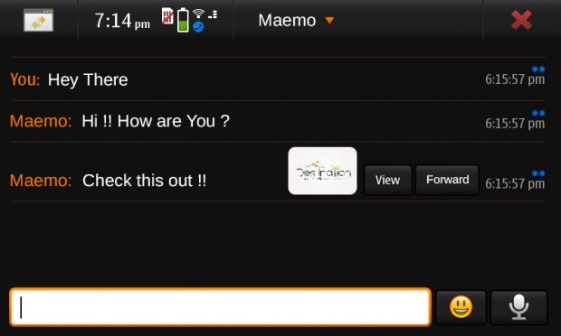
2. In Conversation page how about we add those orange lines. And instead of ticks we have circles. Thats related to the yappari icon itself. Secondly the position of the attachments. The image should have two options. Once downloaded viewer can view or forward the image from the chat itself. And lastly the position of the type dialogue box. Well thats a personal choice of shifting the smileys and send/record button to the right. But they should be a bit smaller than the current ones.
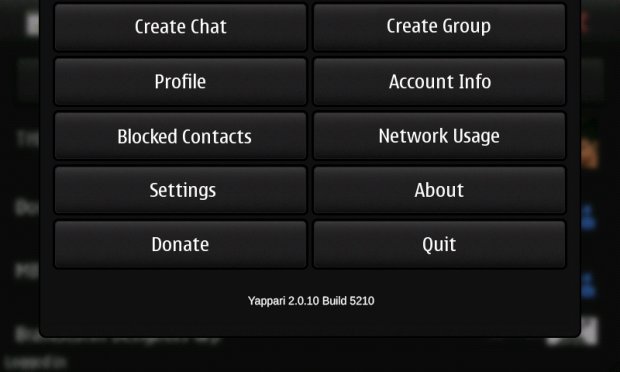
3. The last one is the Drop down menu. I have arranged the options as per priority and moved the sync now option to settings. and finally underneath it the Yappari version and build.
Let me know what you think guys..
1. For the Main page I was thinking we could split it into two. As I feel the scrolling is very laggy sometimes. When you have too many groups and chats. And if we could change the layout of the time on the right side, under the image. The image will be a 1:1 square.
2. In Conversation page how about we add those orange lines. And instead of ticks we have circles. Thats related to the yappari icon itself. Secondly the position of the attachments. The image should have two options. Once downloaded viewer can view or forward the image from the chat itself. And lastly the position of the type dialogue box. Well thats a personal choice of shifting the smileys and send/record button to the right. But they should be a bit smaller than the current ones.
3. The last one is the Drop down menu. I have arranged the options as per priority and moved the sync now option to settings. and finally underneath it the Yappari version and build.
Let me know what you think guys..
| The Following User Says Thank You to BlazingBird For This Useful Post: | ||
|
|
2015-05-04
, 21:03
|
|
Posts: 180 |
Thanked: 180 times |
Joined on Nov 2014
@ New Delhi, DELHI, INDIA
|
#764
|
Great BlazingBird. I agree to all your suggestions.
|
|
2015-05-04
, 22:04
|
|
Posts: 197 |
Thanked: 145 times |
Joined on Dec 2011
@ Dubai, U.A.E.
|
#765
|
I want to make suggest something different as well. Can we make the main ui of the app something like this. A two pane. Where u can see chats and groups differently. With a brief of previous message before. And more visual hi res Avatars.
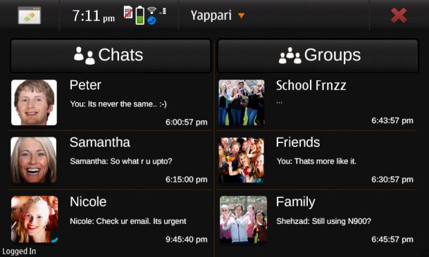
For the Chats menu. We can directly click on the chats button and select our task.
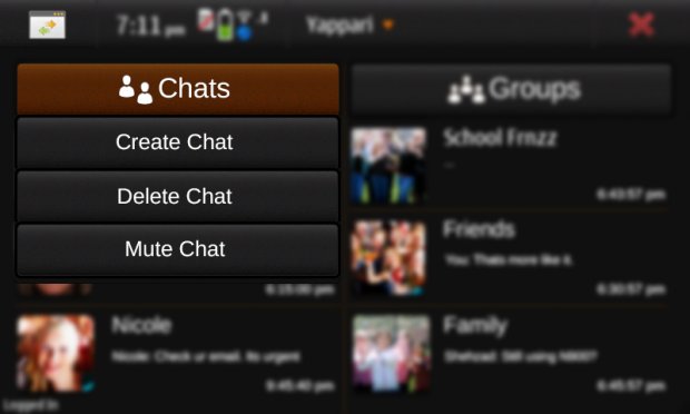
The same goes for Groups. Please let me know ur comments on this as well guys.. Thanks..
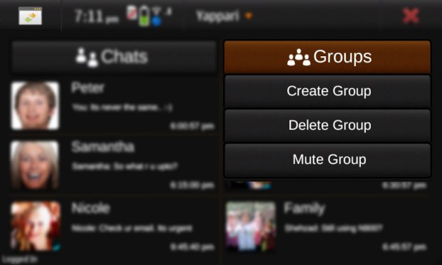
For the Chats menu. We can directly click on the chats button and select our task.
The same goes for Groups. Please let me know ur comments on this as well guys.. Thanks..
| The Following 3 Users Say Thank You to BlazingBird For This Useful Post: | ||
|
|
2015-05-04
, 22:10
|
|
Community Council |
Posts: 680 |
Thanked: 1,227 times |
Joined on Sep 2010
@ Mbabane
|
#766
|
Not all of us use groups so extensively, so this design would eat up too much screen estate. If implemented, could ceene please make it possible to choose between this group-oriented and from 'stock' design.
|
|
2015-05-05
, 05:44
|
|
Posts: 197 |
Thanked: 145 times |
Joined on Dec 2011
@ Dubai, U.A.E.
|
#767
|
We do have a very wider space when we have a landscape device. So why not use it. But if it seems so tightly build up then choice is yours. It was just an idea of having two different tabs or panes for two categories. I do have lots of groups and its difficult for me all the time to scroll up and down in the same window.
|
|
2015-05-05
, 07:03
|
|
Posts: 40 |
Thanked: 41 times |
Joined on Sep 2013
|
#768
|
I think that Yappari is working perfectly at the moment - thanks to Coderus et al for their efforts. ... if it aint broke, dont fix it ...
| The Following 2 Users Say Thank You to Frasier For This Useful Post: | ||
|
|
2015-05-05
, 07:38
|
|
Posts: 197 |
Thanked: 145 times |
Joined on Dec 2011
@ Dubai, U.A.E.
|
#769
|
Its not about fixing but rather than the design element. To make it more rich in terms of UI
| The Following 3 Users Say Thank You to BlazingBird For This Useful Post: | ||
|
|
2015-05-05
, 08:15
|
|
Posts: 207 |
Thanked: 967 times |
Joined on Apr 2014
@ Madrid, Spain
|
#770
|
Originally Posted by BlazingBird

I'm thinking of the two column view. Since it's true that some people use more groups than personal chats -or viceversa- maybe simply the two column arrangement can be done without dedicating each one to a different category, but only to double the amount of information visible in one screen -and avoiding scroll as much as possible-.

I want to make suggest something different as well. Can we make the main ui of the app something like this. A two pane. Where u can see chats and groups differently. With a brief of previous message before. And more visual hi res Avatars.
Attachment 36999
__________________
OVI and downloads.maemo.nokia.com mirror
Yappari for Maemo
pyLedger for Maemo
If you want to donate, please read this. If you still want to donate, contact me via private message or email. Thank you.
OVI and downloads.maemo.nokia.com mirror
Yappari for Maemo
pyLedger for Maemo
If you want to donate, please read this. If you still want to donate, contact me via private message or email. Thank you.
| The Following 3 Users Say Thank You to ceene For This Useful Post: | ||


