


Active Topics
-
Is there a section to talk about Java ME? Apps, etc. (6)
to General by Kalatti - 3 days, 11 hrs ago -
Full linux distros on Sailfish OS (253)
to SailfishOS by qoh - 6 days, 5 hrs ago - more...
| The Following 5 Users Say Thank You to andybehr For This Useful Post: | ||
 |

|
2009-11-01
, 21:48
|
|
Posts: 3,397 |
Thanked: 1,212 times |
Joined on Jul 2008
@ Netherlands
|
#42
|
Maemo status area is smaller than normal. Why? Either
This reads like Chinese:
From my memory logs went like:
Black: Source -> Destination (-> denotes normal move without interference)
White: Source +- Destination (+- denotes king is checked)
There was a symbol to show if some piece got killed too but I forgot which one.
Could also show small icon of piece of Source (and killed piece on Destination, or killed piece inbetween Source and Destination with a red stripe through it).
I suggest to resemble that style of logging. It is a mini-log after all. It could be a button too, allowing one to see full log. Allowing logs to be saved seems cool feature too. Although this can be in Settings or Options menu.
What is also confusing to eye is that black and white are written in same color (white) with background same color (black). Instead, use actual color to describe who is black or white. Just like done on board.
Between the times use a clock or stopwatch symbol. Make clear which time is for which player.
What is C60a Spanish (Ruy Lopez)?
Resign/Draw/Options should follow the Maemo theme.
- Have it on top and live with the lost space. From the Maemo status area middle part is also where you see all buttons normally, such as Resign/Draw/Options.
- Allow and recommend fullscreen.
- Make the small status area a valid use modus operandi. Must keep in mind modifications or different usage from default Maemo status area.
- Allow and recommend portrait mode. Have Maemo status area on top. Not sure how is being dealt with regarding non-default Maemo status area and size of Maemo status area. Does allow more area of screen where X=Y.
This reads like Chinese:
Last move: 3.Bb5
Black: Source -> Destination (-> denotes normal move without interference)
White: Source +- Destination (+- denotes king is checked)
There was a symbol to show if some piece got killed too but I forgot which one.
Could also show small icon of piece of Source (and killed piece on Destination, or killed piece inbetween Source and Destination with a red stripe through it).
I suggest to resemble that style of logging. It is a mini-log after all. It could be a button too, allowing one to see full log. Allowing logs to be saved seems cool feature too. Although this can be in Settings or Options menu.
What is also confusing to eye is that black and white are written in same color (white) with background same color (black). Instead, use actual color to describe who is black or white. Just like done on board.
Between the times use a clock or stopwatch symbol. Make clear which time is for which player.
What is C60a Spanish (Ruy Lopez)?
Resign/Draw/Options should follow the Maemo theme.
Originally Posted by c0rt3x

I assume time mode is optionable, or may have high setting not to be taken too seriously.
3D view is completely unplayable... especially for bullet and blixt games. But it's fine as long as you play offline versus the N900, without time limits that is.
__________________
Goosfraba! All text written by allnameswereout is public domain unless stated otherwise. Thank you for sharing your output!
Goosfraba! All text written by allnameswereout is public domain unless stated otherwise. Thank you for sharing your output!
 |
|
2009-11-01
, 21:52
|
|
Posts: 84 |
Thanked: 50 times |
Joined on Mar 2007
@ Saarbrücken - Germany
|
#43
|
The view (GUI) of course will be decoupled from the core.
I think the first step should be a flat 2D view.
But a more fancy 3D look can be added later.
I think the first step should be a flat 2D view.
But a more fancy 3D look can be added later.
|
|
2009-11-01
, 21:57
|
|
Posts: 367 |
Thanked: 176 times |
Joined on Oct 2009
|
#44
|
Originally Posted by andybehr
A fancy 3D look is nice to have, but it should be nothing more than optional.
The view (GUI) of course will be decoupled from the core.
I think the first step should be a flat 2D view.
But a more fancy 3D look can be added later.
|
|
2009-11-01
, 22:03
|
|
Posts: 3,397 |
Thanked: 1,212 times |
Joined on Jul 2008
@ Netherlands
|
#45
|
Originally Posted by c0rt3x
Agreed, I didn't imply otherwise. Just keep in mind some people prefer a less serious, easy going game of chess.
A fancy 3D look is nice to have, but it should be nothing more than optional.
__________________
Goosfraba! All text written by allnameswereout is public domain unless stated otherwise. Thank you for sharing your output!
Goosfraba! All text written by allnameswereout is public domain unless stated otherwise. Thank you for sharing your output!
|
|
2009-11-01
, 22:25
|
|
Posts: 84 |
Thanked: 50 times |
Joined on Mar 2007
@ Saarbrücken - Germany
|
#46
|
I think qgil is on the right path for a simple but functional gui.
Here are my altenative suggestions.
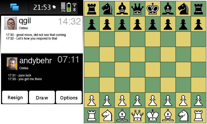
comments?
EDIT: I just realised, the black and white should be flipped to match the board.
Or should the board be flipped and my color (here black) should always be facing me?
Last edited by andybehr; 2009-11-01 at 22:29.
Here are my altenative suggestions.
comments?
EDIT: I just realised, the black and white should be flipped to match the board.
Or should the board be flipped and my color (here black) should always be facing me?
Last edited by andybehr; 2009-11-01 at 22:29.
| The Following 4 Users Say Thank You to andybehr For This Useful Post: | ||
|
|
2009-11-01
, 22:30
|
|
Posts: 3,397 |
Thanked: 1,212 times |
Joined on Jul 2008
@ Netherlands
|
#47
|
Originally Posted by andybehr
Nice. Much better.
I think qgil is on the right path for a simple but functional gui.
Here are my altenative suggestions.
comments?
Caveat: does not include last move or ability to see log.
Also, show rest of Maemo status bar on left bottom. Or use 2 rows. Clicking there gets to Draw/Resign/Options.
Or show the whole Maemo status bar vertically.
There is also no 'cross' to kill the application.
EDIT: I just realised, the black and white should be flipped to match the board.
Or should the board be flipped and my color (here black) should always be facing me?
Don't use grey on white (top right, the time at Qgil)
Outline to middle. IOW, your 'box' should go little bit down giving Qgil half of the screen, and you the other half.
Actually... let them mirror each other. Your time right bottom, his time right top. Your name left bottom, his name left top. Inbetween is chat log.
Hello
.........Hi
Good move
.........Woosh!
Problem is then those goddamn colors again... I have this problem too with my current desktop (Ubuntu with Humanity theme). Dark gray icons on light gray background. OK... but if I use black background instead of light gray its ugly or not usable, and the black text on light gray is then not usable. Not only black, any color too dark is not usable. A too light color is either much like default light gray, or just ugly. I don't know how to solve this... maybe, in your case, use default theme's colours. We know who is black and who is white because position on screen tells us this. Otherwise a small (inverse) icon behind name is telling. Like this one in attached picture on right part of it, can use the icons, with the it lined out inversed, to add dimension. Screenshot simply from MS Paint.
__________________
Goosfraba! All text written by allnameswereout is public domain unless stated otherwise. Thank you for sharing your output!
Goosfraba! All text written by allnameswereout is public domain unless stated otherwise. Thank you for sharing your output!
Last edited by allnameswereout; 2009-11-01 at 22:50.
| The Following User Says Thank You to allnameswereout For This Useful Post: | ||
|
|
2009-11-01
, 22:37
|
|
Posts: 367 |
Thanked: 176 times |
Joined on Oct 2009
|
#48
|
You guys should check out Scid's ECO system. It's by far the best opening systematization I've seen. And it's also my personal chess (.pgn files) viewer of choise.
I'd be nice to have a built-in opening database which automatically displays the current opening's name.
http://scid.sourceforge.net/download.html
Last edited by c0rt3x; 2009-11-01 at 22:41.
I'd be nice to have a built-in opening database which automatically displays the current opening's name.
http://scid.sourceforge.net/download.html
Last edited by c0rt3x; 2009-11-01 at 22:41.
| The Following User Says Thank You to c0rt3x For This Useful Post: | ||
|
|
2009-11-01
, 22:51
|
|
Posts: 84 |
Thanked: 50 times |
Joined on Mar 2007
@ Saarbrücken - Germany
|
#49
|
Caveat: does not include last move or ability to see log.
There is also no 'cross' to kill the application.

But yes, good point, how is this handled in other fullscreen apps/games like Bounce? Don't have my N900 yet. I will check the HID guidelines.
Good Q. IMO flipped.
Don't use grey on white (top right, the time at Qgil)
Outline to middle. IOW, your 'box' should go little bit down giving Qgil half of the screen, and you the other half.
Actually... let them mirror each other. Your time right bottom, his time right top. Your name left bottom, his name left top. Inbetween is chat log.
Last edited by andybehr; 2009-11-01 at 23:34.
| The Following User Says Thank You to andybehr For This Useful Post: | ||
|
|
2009-11-01
, 22:57
|
|
Posts: 367 |
Thanked: 176 times |
Joined on Oct 2009
|
#50
|
Is the engine smart enough to determine whether it's worthy to accept an offered draw (by the player)? This shouldn't really be difficult to implement; if the position is evaluated as superior to the player, then the draw offer should be accepted; however, if the position is evaluated as inferior or equal to the player, then the draw offer should be declined.
There should be different degrees of the engine's "will" to draw (a parameter that should be adjustable for the player): whether the engine will accept a draw if the position is evaluated as equal.
Keep in mind that the engine's evaluation isn't always spot on either!
There should be different degrees of the engine's "will" to draw (a parameter that should be adjustable for the player): whether the engine will accept a draw if the position is evaluated as equal.
Keep in mind that the engine's evaluation isn't always spot on either!
 |
| Tags |
| chess, development, game |
«
Previous Thread
|
Next Thread
»
|
All times are GMT. The time now is 15:19.
Logic:
Game - the logic for a particular game, right now that would be just chess, but other board games could be possible too. (Chess based or other)
Pre-Game - How to find players, select a server or engine
Domain:
Board - Represents the data structure of the board (duh)
Player - information about the other player, like online status, skill level
Communication:
ICS
Bluetooth
Telepathy
Computer Chess Engine - an offline engine should be accessed the same way any online game is, the engine does not have to be in the same task