


Active Topics
-
Is there a section to talk about Java ME? Apps, etc. (6)
to General by Kalatti - 3 days, 10 hrs ago -
Full linux distros on Sailfish OS (253)
to SailfishOS by qoh - 6 days, 4 hrs ago - more...


|
2013-08-09
, 16:18
|
|
Posts: 578 |
Thanked: 994 times |
Joined on Dec 2012
|
#62
|
Or maybe it's not  ... five seconds searching...
In transition.ini:
Task Nav
[task_nav]
tile_font = Nokia Sans 15
... five seconds searching... In transition.ini:
Task Nav
[task_nav]
tile_font = Nokia Sans 15
|
|
2013-08-09
, 19:17
|
|
Posts: 383 |
Thanked: 344 times |
Joined on Jun 2013
@ Greece, Athens
|
#63
|
Originally Posted by elros34

but this is for the task navigator... not for the app menu... right?
Or maybe it's not
In transition.ini:
Task Nav
[task_nav]
tile_font = Nokia Sans 15
|
|
2013-08-09
, 23:16
|
|
Posts: 383 |
Thanked: 344 times |
Joined on Jun 2013
@ Greece, Athens
|
#65
|
Originally Posted by elros34
does this 15 is for the size of the letter? or the font is just named "Nokia Sans 15"? Because if this is the whole this won't really help me for making smaller the letters without the theme-customizer.
it works in app menu
|
|
2013-08-09
, 23:31
|
|
Posts: 383 |
Thanked: 344 times |
Joined on Jun 2013
@ Greece, Athens
|
#66
|
Originally Posted by Alecsandru
Ok I installed the catorise plus. I thought it was looking ugly because of the mod
there are 15 groups in catorise plus , organized by 3 on the line in portrait , 5 rows
with new hildon there are only four rows and a empty area , this one is no go for me , i have many programs installed ,the purge of catorise isn't an option , at least not for me , but I appreciate your work
 but it is not that bad... but we will see if we can have some other modded menus as well
| The Following User Says Thank You to bill_klpd For This Useful Post: | ||
|
|
2013-08-10
, 00:50
|
|
Posts: 578 |
Thanked: 994 times |
Joined on Dec 2012
|
#67
|
Originally Posted by bill_klpd
15 it's size of Nokia Sans font. It take you 30s to check it. Change it to e.g. "URW Chancery L 16" and you will see.
does this 15 is for the size of the letter? or the font is just named "Nokia Sans 15"? Because if this is the whole this won't really help me for making smaller the letters without the theme-customizer.
/etc/hildon/theme/transitions.ini
|
|
2013-08-10
, 00:57
|
|
Posts: 383 |
Thanked: 344 times |
Joined on Jun 2013
@ Greece, Athens
|
#68
|
Originally Posted by elros34
Ok.. I thought that there was a way of using the Nokia Sans in a smaller size...
15 it's size of Nokia Sans font. It take you 30s to check it. Change it to e.g. "URW Chancery L 16" and you will see.
/etc/hildon/theme/transitions.ini
|
|
2013-08-10
, 11:39
|
|
Posts: 383 |
Thanked: 344 times |
Joined on Jun 2013
@ Greece, Athens
|
#69
|
Originally Posted by electroaudio
What about this?
Very interesting mod!
Would it be easy to remove the icons and only have a textbased menu instead? or maybe to have small icons to the left and text to the right, almost like it is in FAM?
-----
An another idea is to separate the menu from hildon-desktop and make the menu to a normal application that can be changed by the user at will, without any recompilation of hildon-desktop
Portrait:
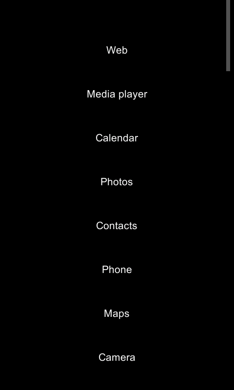
Landscape:
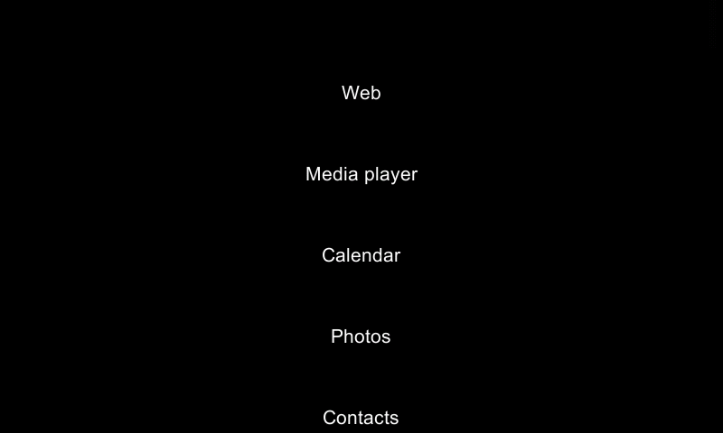
I will try to make one like the FAM with small icons but there is some work to get done for the other menus as well
| The Following 4 Users Say Thank You to bill_klpd For This Useful Post: | ||
 |
|
2013-08-10
, 14:34
|
|
Posts: 381 |
Thanked: 336 times |
Joined on Jan 2011
@ Stockholm, Sweden
|
#70
|
Originally Posted by bill_klpd
Nice THANKS
What about this?
Landscape:
I will try to make one like the FAM with small icons but there is some work to get done for the other menus as well
I never remember what icon is which program (and the tiny white text below usually isnt readable because it gets mixed up with the background) , so the menu as it is has been useless to me.
For me the important part is not how pretty it is to look at, but rather how easy it is to use. So the small icons arent that necessary
Also, i would like a black font. it is much easier for the eyes (and also for a camera...) to see a black font on a light background
Edit: Feel free to call it the grandpa theme
__________________
Deskypplet , a desktop for N900 *RIP*
Deskypplet , a desktop for N900 *RIP*
Last edited by electroaudio; 2013-08-10 at 15:11.
| The Following 2 Users Say Thank You to electroaudio For This Useful Post: | ||
Some lines after this you can also change the place of the name