


Active Topics
-
Is there a section to talk about Java ME? Apps, etc. (3)
to General by Kalatti - 7 hrs, 44 mins ago - more...

| The Following 8 Users Say Thank You to SaiFi For This Useful Post: | ||

|
2019-03-21
, 14:40
|
|
Posts: 13 |
Thanked: 61 times |
Joined on Nov 2018
|
#552
|
About voting: French non-profit Framasoft hosts a number of free services, one of them being for polls.
The items to vote on can be images (.jpg only, it seems), votes are yes/maybe/no, and voters can vote for more than on item. I think that would fit the purpose here, no?
Have a look here to decide: https://framadate.org/
The items to vote on can be images (.jpg only, it seems), votes are yes/maybe/no, and voters can vote for more than on item. I think that would fit the purpose here, no?
Have a look here to decide: https://framadate.org/
| The Following 8 Users Say Thank You to SaiFi For This Useful Post: | ||
 |
|
2019-03-21
, 18:21
|
|
Posts: 362 |
Thanked: 1,373 times |
Joined on Nov 2015
@ Sweden
|
#553
|
I'm not in to graphics, so I can't say much about icons, but I must say I love what you guys are doing. Many thanks to rinigus, mosen and all other contributors for the best SFOS community app so far. 
|
|
2019-03-21
, 18:30
|
|
Posts: 1,414 |
Thanked: 7,547 times |
Joined on Aug 2016
@ Estonia
|
#554
|
Originally Posted by mosen

I have incorporated these versions for routing. The only one which is not used is "route from N". The versions "N" provided here are shown on the map directly and we don't have route-from icon in this case. All SFOS versions made it.
Kirigami is good.
For sfos i linked a version with the center-dot not 60% transp. to stand out more and not look like it is part of the road somehow. No idea what looks better. For you to try.
On-Map nav-to an nav-from linked in zip. (Edit, oh, nav-from is not used on map. lol. Don't mind then.)
Edit, now i understand what you ment some pages back... The nav-from looks much better with position-marker pointing up. Before it looked like a POI marker when facing down. Small but nice change!
So, we are basically ready for release which would be a great checkpoint to ensure that nothing is mixed up & we are all on the same page.
I should probably incorporate 3 profile icons as well and then the slots will be ready for update when these icons are ready.
@SaiFi: item picker for profiles will just use too much space, I think. Right now its compact and (while seems to be not always discoverable) convenient way to swap between combination of services. Actually, having an indicator for current profile maybe sufficient and is also a visual representation of the same data as in text. I wonder if ew will start catching active profile faster with swapping icon or not...
 |
|
2019-03-21
, 19:16
|
|
Community Council |
Posts: 1,669 |
Thanked: 10,225 times |
Joined on Nov 2014
@ Lower Rhine
|
#555
|
Originally Posted by SaiFi
I share that thought and the reason i did 3 individual icons is based on the assumption that, even if the user would not understand the icon alone on first glance in the menu, the actual presentation in the menus is:
About the profile icon(s): Is this a pure status indicator or a way to switch profiles? Because, I understand them when I see the three variants side-by-side, but I'm not sure I would immediately interpret the meaning seeing only one of them. So for me, they work best in a context where all three are visible. Like in an "item picker" of some sort.
Icon (status) -> text: Profile -> text: (status) -> icon arrow to indicate.
So even without clicking the row and go to the selection page where ideally all 3 icons are listed with the status written out as text, the user could understand from the word "profiles" followed by the status text.
I tried rinigus request for a storage symbol to represent "offline" but came to no conclusion because either they are pie-charts, hdds, usb-sticks or even server racks. One standard symbol for storage even looks like a cylindrical version of our new map-layer icon... Technically we would need to symbolize flash memory, but how?
For now i did some variations based on recent comments to the 3 existing ones
__________________
Watch our weird watchfaces for mighty AsteroidOS
Performance comparison Video Sailfish 2.0 vs 1.1.9 vs 1.1.7
[MC eV] Maemo Community eV membership application please concider to join!
Watch our weird watchfaces for mighty AsteroidOS
Performance comparison Video Sailfish 2.0 vs 1.1.9 vs 1.1.7
[MC eV] Maemo Community eV membership application please concider to join!
| The Following 7 Users Say Thank You to mosen For This Useful Post: | ||
 |
|
2019-03-21
, 20:28
|
|
Posts: 173 |
Thanked: 512 times |
Joined on Jul 2018
@ Guatemala
|
#556
|
very promising the art work of @mosen, you know what u doing -. nice to helping the huge work @rinigus/@otsaloma. ths 
and YES MosenCertificates will work!!!
Last edited by carlosgonz; 2019-03-21 at 20:47.
and YES MosenCertificates will work!!!
__________________
Nokia N95 / Nokia N900 / Nokia N9 / Nokia N8 / Jolla 1 / Jolla C / Xperia X / Xperia 10 II / PinePhone / Librem 5
TI Chronos
Nokia N95 / Nokia N900 / Nokia N9 / Nokia N8 / Jolla 1 / Jolla C / Xperia X / Xperia 10 II / PinePhone / Librem 5
TI Chronos
Last edited by carlosgonz; 2019-03-21 at 20:47.
|
|
2019-03-21
, 21:14
|
|
Posts: 1,414 |
Thanked: 7,547 times |
Joined on Aug 2016
@ Estonia
|
#557
|
I have just released the current state as 1.18.0
The most of the work done on this release was made by mosen, Fellfrosch, and everyone participating in the discussion regarding new visual elements (icons, banner, overall look). Work is not finished, but progress has been made. [New certificates have been proposed and, hopefully, icons for those will be designed in time].
As for other features, I didn't have much time to work on it. However, Pure Maps supports now command line options and DBus API. On Sailfish, Pure Maps is launched via harbour-pure-maps which is actually bash script. That script allows you to either start with some geo: coordinate or forward that coordinate to a running instance. Currently only geo: is supported as a command line option. In future, we could expand it relatively simply to support more Pure Maps functionality via command line and DBus if the interest will be there.
Word of caution, current DBus API will hopefully change as soon as https://bugs.merproject.org/show_bug.cgi?id=2029 will get fixed. I'll be able to name the methods in agreement with common DBus notations.
Kirigami build will be uploaded to Flathub as soon as its available (still building). It is using new Kirigami API making it way better on desktop - its map which is expanded instead of the last page when you make a window wider. We would have to thank Kirigami developers for such adjustments in API.
As always, translators responded fast and I would expect to have few point releases, if needed.
| The Following 10 Users Say Thank You to rinigus For This Useful Post: | ||
|
|
2019-03-21
, 21:40
|
|
Community Council |
Posts: 1,669 |
Thanked: 10,225 times |
Joined on Nov 2014
@ Lower Rhine
|
#558
|
Great news rinigus!
Though i was late in doing olfs corrections to the nearby markers now.
But at least chances rise for 1.19 to come soon
EDIT First impression is really good.
Only the transparency on the map icons is different than i planned. I tried to have the same difference like the sfos ones have. So like 100% and 60%. Now it looks more like 100% and 80%.
Compare to the center-position button grey circle, that's what was planned. I guess i messed up while checking in gimp. Gimp has a different representation of svg transparency.
How should we go about? I could simply try to set same transparency level like the center-position button for the relevant icons and repost.
Last edited by mosen; 2019-03-21 at 21:56.
Though i was late in doing olfs corrections to the nearby markers now.
But at least chances rise for 1.19 to come soon
EDIT First impression is really good.
Only the transparency on the map icons is different than i planned. I tried to have the same difference like the sfos ones have. So like 100% and 60%. Now it looks more like 100% and 80%.
Compare to the center-position button grey circle, that's what was planned. I guess i messed up while checking in gimp. Gimp has a different representation of svg transparency.
How should we go about? I could simply try to set same transparency level like the center-position button for the relevant icons and repost.
__________________
Watch our weird watchfaces for mighty AsteroidOS
Performance comparison Video Sailfish 2.0 vs 1.1.9 vs 1.1.7
[MC eV] Maemo Community eV membership application please concider to join!
Watch our weird watchfaces for mighty AsteroidOS
Performance comparison Video Sailfish 2.0 vs 1.1.9 vs 1.1.7
[MC eV] Maemo Community eV membership application please concider to join!
Last edited by mosen; 2019-03-21 at 21:56.
| The Following 7 Users Say Thank You to mosen For This Useful Post: | ||
 |
|
2019-03-21
, 22:18
|
|
Posts: 304 |
Thanked: 1,246 times |
Joined on Aug 2015
|
#559
|
Originally Posted by mosen
Thanks, these are really nice!
I vote for ...
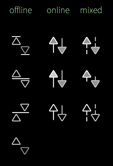
- Row 1, column 1 (offline mode)
- Row 3, column 2 (online mode)
- Row 3, column 3 (mixed mode)
| The Following 3 Users Say Thank You to olf For This Useful Post: | ||
|
|
2019-03-22
, 03:15
|
|
Posts: 127 |
Thanked: 313 times |
Joined on Sep 2016
@ Yekaterinbourg, Russia
|
#560
|
I vote for:
- Row 4 (offline mode)
- Row 3, column 2 (online mode)
- Row 3, column 3 (mixed mode)
- Row 4 (offline mode)
- Row 3, column 2 (online mode)
- Row 3, column 3 (mixed mode)
| The Following 3 Users Say Thank You to XOleg For This Useful Post: | ||
I have been following this discussion from the sidelines, as I haven't felt I had much to contribute. In general, I find all the suggested icons good after the iterations made.
I do have a preference for simple shapes that I will understand and recognize immediately, and as such I actually like the current navigation icon (the split arrows).
Anyway, I also like the new, "winding road" icon, and I think the N shape is genius. It's mnemonic in many languages using a latin script. I agree with mosen saying that the version with the location marker in the middle looks like I'm already navigating. Prefer the version where the road starts at the current position.
About the profile icon(s): Is this a pure status indicator or a way to switch profiles? Because, I understand them when I see the three variants side-by-side, but I'm not sure I would immediately interpret the meaning seeing only one of them. So for me, they work best in a context where all three are visible. Like in an "item picker" of some sort.