


Active Topics
-
Which is the best N95? What software modifications could be made to it? (3)
to General by Kalatti - 9 hrs, 7 mins ago -
Installing CSSU Stable in year 2024 (2)
to Maemo 5 / Fremantle by teroyk - 16 hrs, 36 mins ago -
Porting apps to Leste (34)
to Maemo 7 / Leste by Arno_11 - 1 day, 2 hrs ago -
[ANNOUNCE] CSSU-thumb thread - stable Thumb2 on N900 (2,266)
to Maemo 5 / Fremantle by pali - 2 days, 18 hrs ago -
Firefox with Leste (7)
to Maemo 7 / Leste by teroyk - 2 days, 22 hrs ago - more...

| The Following 7 Users Say Thank You to rinigus For This Useful Post: | ||

|
2019-06-02
, 14:47
|
|
Posts: 1,414 |
Thanked: 7,547 times |
Joined on Aug 2016
@ Estonia
|
#712
|
@olf: if we rearrange navigation mode into a bit more limited one, X can be used for dropping route as well.
@olf: do you know that you could make more space for seeing map by tapping on a map while POI data is shown? although it will not help with the drastic example that you show in the issue. for the latter one, you do need a bigger screen
@olf: do you know that you could make more space for seeing map by tapping on a map while POI data is shown? although it will not help with the drastic example that you show in the issue. for the latter one, you do need a bigger screen
| The Following 5 Users Say Thank You to rinigus For This Useful Post: | ||
|
|
2019-06-03
, 20:11
|
|
Posts: 958 |
Thanked: 3,426 times |
Joined on Apr 2012
|
#713
|
@rinigus, thank you for considering the UI issue, and for putting up with my ranting.
How do you select which engine to use? Which engines provide autosuggestions? This could be useful to display somewhere in settings (if it isn't already).
The reason it took me so long to work this out (I was tapping on the map instead) is that the top panel doesn't look like a traditional tappable SailfishOS UI element. Additionally, once I've done it once (which I did by accident, trying to swipe instead), the "tap to begin navigating" message doesn't appear and there are no longer any visual clues as to what you need to do.
My other point (which I might not have made clear) was that if I enter, for example, "1234 north main st <city>", I get a list of results, which look like:
3. (assuming that you use engine with autosuggetions) Select destination
6. Tap on the top panel, as suggested in a message in it
My other point (which I might not have made clear) was that if I enter, for example, "1234 north main st <city>", I get a list of results, which look like:
- North Main Street, <city>, <country> 1.9 mi south-east
- North Main Street, <city>, <country> 3.7 mi south
- North Main Street, <city>, <country> 2.4 mi north-east
- North Main Street, <city>, <country> 4.6 mi north-east
- North Main Street, <city>, <country> 1.9 mi east
__________________
Saera: A Siri clone for the N900, N9(50) and Jolla
Follow me on Twitter: twitter.com/taixzo
Saera: A Siri clone for the N900, N9(50) and Jolla
Follow me on Twitter: twitter.com/taixzo
| The Following 6 Users Say Thank You to taixzo For This Useful Post: | ||
|
|
2019-06-04
, 06:28
|
|
Posts: 1,414 |
Thanked: 7,547 times |
Joined on Aug 2016
@ Estonia
|
#714
|
Originally Posted by taixzo

As long as its constructive and with the target of making the applications better - we are absolutely fine
@rinigus, thank you for considering the UI issue, and for putting up with my ranting.
Originally Posted by taixzo
Every time you search, you can choose the engine using pull down menu. Its an item in the menu called "Using Photon", for example. The choices are available while you are online. Offline, its only OSM Scout Server.
How do you select which engine to use? Which engines provide autosuggestions? This could be useful to display somewhere in settings (if it isn't already).
From engines, OSM Scout Server and Photon support autosuggestions. So, while you type, the engine is searching (after few characters, I believe) and results are shown below the search string.
As for marking that, issue is opened https://github.com/rinigus/pure-maps/issues/262
Originally Posted by taixzo
I agree, we need a better UI for that and I think we will move over to have buttons on the map that will allow you to start navigation. The related issues that I will have to think about it are https://github.com/rinigus/pure-maps/issues/149 and maybe also https://github.com/rinigus/pure-maps/issues/139 (latter if we make it somehow easy to switch between car/walk/... while in the map view)
The reason it took me so long to work this out (I was tapping on the map instead) is that the top panel doesn't look like a traditional tappable SailfishOS UI element. Additionally, once I've done it once (which I did by accident, trying to swipe instead), the "tap to begin navigating" message doesn't appear and there are no longer any visual clues as to what you need to do.
Originally Posted by taixzo
OK, I see. Its probably since 1234 building was not in OSM database and then it finds sections of the street. To approach this, use Search interface.
My other point (which I might not have made clear) was that if I enter, for example, "1234 north main st <city>", I get a list of results, which look like:Since the list doesn't include the street number, I have to guess at which is the right one based on the direction (and guess the distance too - maybe I know it's north-east, but not how far?) A button to show these results on the map would also go a long way toward removing this ambiguity.
- North Main Street, <city>, <country> 1.9 mi south-east
- North Main Street, <city>, <country> 3.7 mi south
- North Main Street, <city>, <country> 2.4 mi north-east
- North Main Street, <city>, <country> 4.6 mi north-east
- North Main Street, <city>, <country> 1.9 mi east
- Tap Search
- Write your string
- Either tap on one result or use pull down menu and choose "Map". [Should I rename it to "Shown on Map"?].
When you are on map, all current search results are shown as POIs (in non-filled form). Tap on any of them, tap on route and you are almost there (x taps away that we are trying to reduce now).
| The Following 8 Users Say Thank You to rinigus For This Useful Post: | ||
 |
|
2019-06-04
, 19:52
|
|
Community Council |
Posts: 1,669 |
Thanked: 10,225 times |
Joined on Nov 2014
@ Lower Rhine
|
#715
|
I think not much change is needed!
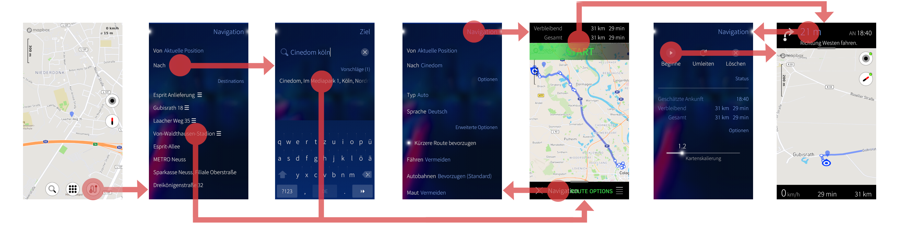
Current situation as described earlier, in a UX-path-screen for navigation.

If we "skip" the option pages and somehow make clear how to reach them, things would be much snappier already imo.
The green "start" bar is ment to be a remorse timer that leads to next page or is dismissed by tapping else where.
I know that feature from Waze and find it super convenient. The footer on the same page should say "route options" because thats where you go back too.
Like that
Last edited by mosen; 2019-06-04 at 20:01.
Current situation as described earlier, in a UX-path-screen for navigation.
If we "skip" the option pages and somehow make clear how to reach them, things would be much snappier already imo.
The green "start" bar is ment to be a remorse timer that leads to next page or is dismissed by tapping else where.
I know that feature from Waze and find it super convenient. The footer on the same page should say "route options" because thats where you go back too.
Like that
__________________
Watch our weird watchfaces for mighty AsteroidOS
Performance comparison Video Sailfish 2.0 vs 1.1.9 vs 1.1.7
[MC eV] Maemo Community eV membership application please concider to join!
Watch our weird watchfaces for mighty AsteroidOS
Performance comparison Video Sailfish 2.0 vs 1.1.9 vs 1.1.7
[MC eV] Maemo Community eV membership application please concider to join!
Last edited by mosen; 2019-06-04 at 20:01.
| The Following 9 Users Say Thank You to mosen For This Useful Post: | ||
|
|
2019-06-04
, 20:10
|
|
Posts: 1,414 |
Thanked: 7,547 times |
Joined on Aug 2016
@ Estonia
|
#716
|
Originally Posted by mosen
wc my post: 975 words
I think not much change is needed!
Current situation as described earlier, in a UX-path-screen for navigation.
https://mosushi.de/misc/puremaps/current.png
If we "skip" the option pages and somehow make clear how to reach them, things would be much snappier already imo.
The green "start" bar is ment to be a remorse timer that leads to next page or is dismissed by tapping else where.
I know that feature from Waze and find it super convenient. The footer on the same page should say "route options" because thats where you go back too.
Like that
https://mosushi.de/misc/puremaps/proposal.png
@mosen: 1 sceme!!!
So, we are getting to that famous relationship regarding words and pictures.
As far as I understood,
- transition between the last two is not clear. Should be somehow indicated better
- we miss where / how to show maneuvers
Also, what should we do with the lower panel and few other issues pointed out towards the end of my post.
| The Following 5 Users Say Thank You to rinigus For This Useful Post: | ||
|
|
2019-06-04
, 20:20
|
|
Community Council |
Posts: 1,669 |
Thanked: 10,225 times |
Joined on Nov 2014
@ Lower Rhine
|
#717
|
Originally Posted by rinigus
simple
wc my post: 975 words
@mosen: 1 sceme!!!
So, we are getting to that famous relationship regarding words and pictures.
As far as I understood,
- transition between the last two is not clear. Should be somehow indicated better
- we miss where / how to show maneuvers
Also, what should we do with the lower panel and few other issues pointed out towards the end of my post.

Just make all bars on the navigation page go back to the "reroute / delete route / scale" page.
From there the rout can be delete -> go back to blank
From there you can reroute -> back to nav with new route
From there you can adjust scale, where it is super usefull to have seen the scale on map before adjusting it btw.
EDIT, a button "Edit Route Options" could be usefull on that "reroute / delete /scale" page, to go back to the 4th screen in my proposal with all options.
EDIT2 that page is called "Navigation" and should be named "Route Options to make it clearer.
Originally Posted by rinigus
Keep it like it is, tapping on the direction arrow?
- we miss where / how to show maneuvers
__________________
Watch our weird watchfaces for mighty AsteroidOS
Performance comparison Video Sailfish 2.0 vs 1.1.9 vs 1.1.7
[MC eV] Maemo Community eV membership application please concider to join!
Watch our weird watchfaces for mighty AsteroidOS
Performance comparison Video Sailfish 2.0 vs 1.1.9 vs 1.1.7
[MC eV] Maemo Community eV membership application please concider to join!
Last edited by mosen; 2019-06-04 at 20:52.
| The Following 6 Users Say Thank You to mosen For This Useful Post: | ||
|
|
2019-06-05
, 11:55
|
|
Community Council |
Posts: 1,669 |
Thanked: 10,225 times |
Joined on Nov 2014
@ Lower Rhine
|
#718
|
To visualize my latest EDITs above with some more (<1000words) remarks.

4th screen
- holds all Route options so should be called like that.
5th screen, route-display
- START Remorse timer as mentioned and top bar as known by recurring users lead to nav-view directly
- Go back to route options if the displayed route is not to your liking with properly named bottom bar.
- Delete/Dismiss route and go back to 2nd screen as always with the X
- The burger menu is irritating and frankly i never felt the need to go back to 2nd screen other than when deleting a route. so for me it is redundant with the X button.
- maybe place the X right and Route options left?
- maybe have a circle below the X to make it look more like a button and familiar to the one in "route" page (6th screen)?
6th screen
- is all about Route so also call it accordingly.
- should not go to "Instructions" via left-to-right(?) swipe. That swipe is associated with confirm/continue in sailfish so left swipe should go "back" to nav-view in above example and not like currently into "oneway street" instructions page where you can not continue with same swipe.
- This page needs a link back to route potions to be able to do all functionality when coming back from nav-view -> Route -> to route options
7th screen, nav-view
- new link from instruction arrow to Instructions page. (Like in Waze and Here)
- all other clickable area on all bars go "back" to route page where again all functionality is provided to cancel the route or further back edit it via new link to route options.
8th screen, Instructions.
- Frankly, now idea, never used it.
I see clicking the row gives a view of that turn. No idea where to put that in my proposal. i would make it only text and make it possible to go back to nav-view with right-to-left swipe.
Damn, need to move now, more later
__________________
Watch our weird watchfaces for mighty AsteroidOS
Performance comparison Video Sailfish 2.0 vs 1.1.9 vs 1.1.7
[MC eV] Maemo Community eV membership application please concider to join!
Watch our weird watchfaces for mighty AsteroidOS
Performance comparison Video Sailfish 2.0 vs 1.1.9 vs 1.1.7
[MC eV] Maemo Community eV membership application please concider to join!
| The Following 5 Users Say Thank You to mosen For This Useful Post: | ||
 |
|
2019-06-05
, 13:35
|
|
Posts: 237 |
Thanked: 502 times |
Joined on May 2010
@ Mittelfranken, Germany
|
#719
|
I find the part where it gets confusing is where you leave the Sailfish UX. There should be mo bottom bar to press. Instead the top bar could be usual hint left to go back to somewhere, hint right to go forward somewhere with each a little descriptiv text. The routing information could be moved a bit down to make roomfor that.
| The Following 6 Users Say Thank You to Amboss For This Useful Post: | ||
|
|
2019-06-05
, 14:02
|
|
Community Council |
Posts: 1,669 |
Thanked: 10,225 times |
Joined on Nov 2014
@ Lower Rhine
|
#720
|
I see...
I considered the two "non-sailfish" screens (route-display & nav-view) to be part of the map and just used what was there to operate with.
But i agree in the route-display it is not obvious (enough) to press a bottom bar if you never done/needed to before.
Same for deleting the route with the X placed in said bar.
But having it in the sfos way described by you it implies the wrong impression to actually go "back" imo. Since reordering the nav-ux-path users come from selecting a destination directly to route-display. There is no "back" anymore so the change to Route options could be made clear by other means than the strict sailfish swipe forth/back paradigm.
Only rough thoughts thou.
EDIT
Pro for having the two bars is that the route-display and nav-view page then look very similar which gives a nice "continous" impression anytime a route is displayed on map. Also the bottom bars lead to the corresponding Option/status pages in both cases which is a kind of continuos behaviour "in-map".
Last edited by mosen; 2019-06-05 at 14:09.
I considered the two "non-sailfish" screens (route-display & nav-view) to be part of the map and just used what was there to operate with.
But i agree in the route-display it is not obvious (enough) to press a bottom bar if you never done/needed to before.
Same for deleting the route with the X placed in said bar.
But having it in the sfos way described by you it implies the wrong impression to actually go "back" imo. Since reordering the nav-ux-path users come from selecting a destination directly to route-display. There is no "back" anymore so the change to Route options could be made clear by other means than the strict sailfish swipe forth/back paradigm.
Only rough thoughts thou.
EDIT
Pro for having the two bars is that the route-display and nav-view page then look very similar which gives a nice "continous" impression anytime a route is displayed on map. Also the bottom bars lead to the corresponding Option/status pages in both cases which is a kind of continuos behaviour "in-map".
__________________
Watch our weird watchfaces for mighty AsteroidOS
Performance comparison Video Sailfish 2.0 vs 1.1.9 vs 1.1.7
[MC eV] Maemo Community eV membership application please concider to join!
Watch our weird watchfaces for mighty AsteroidOS
Performance comparison Video Sailfish 2.0 vs 1.1.9 vs 1.1.7
[MC eV] Maemo Community eV membership application please concider to join!
Last edited by mosen; 2019-06-05 at 14:09.
| The Following 5 Users Say Thank You to mosen For This Useful Post: | ||
@Fuzzillogic: rounding to 1km, issue opened https://github.com/rinigus/pure-maps/issues/259
@Fuzzillogic: while we have a help message suggesting you to tap top bar to start navigation, we should make start available as a button (see my prev post)
@Fuzzillogic: map rotation by by hand and/or compass.
@taixzo: nearby and search issue is opened at https://github.com/rinigus/pure-maps/issues/261
@mosen: in the latest version, on navigation page, you get list of destinations if To is not set. This list is shortlisted POIs first and followed by recent destinations, the latest first
@mosen: seems that our vision is rather similar, isn't it? although remorse timer may help us even to avoid pressing start after route is shown.