|
|
2008-08-25
, 16:39
|
|
|
Posts: 5,478 |
Thanked: 5,222 times |
Joined on Jan 2006
@ St. Petersburg, FL
|
#12
|
Originally Posted by bunanson

****! and the Diablo thread has more than 478+ posts!!! I WOULDN'T UPGRADE TO THAT, EITHER!!!! http://www.internettablettalk.com/fo...ad.php?t=21233
But I would have reservation to go to that version after more than 398+ posts and http://www.internettablettalk.com/fo...ad.php?t=23132

|
|
2008-08-25
, 16:48
|
|
|
Posts: 4,783 |
Thanked: 1,253 times |
Joined on Aug 2007
@ norway
|
#13
|
hmm, lets just hope that nokia dont turn this into a remake of ms longhorn (we all know how that ended).
|
|
2008-08-25
, 17:37
|
|
|
Posts: 1,562 |
Thanked: 349 times |
Joined on Jun 2008
|
#14
|
As for Diablo, yes, it's not one to go to yet. I've seen way too many problems with it, and downgraded from it myself after suffering through many of those. As for the UI stuff, I can help with that as I'm a part time UI designer. I can't code in the languages required to build the UI's, but I can help with the actual design and layout elements, as that's where I typically focus most of my time.
As for good UI designs, I like this one for the wireless icon in the status bar:
http://tabletui.wordpress.com/2008/0...ready-to-surf/
That example really is nice, and aside from a few minor changes to the icons (for easier viewing of the variations), I think it's a good idea. I also suggested a few other UI improvements to the wireless interface in another thread. If someone wants me to, I can do some mockups so you can see the changes I've suggested.
|
|
2008-08-25
, 17:46
|
|
|
Posts: 3,220 |
Thanked: 326 times |
Joined on Oct 2005
@ "Almost there!" (Monte Christo, Count of)
|
#15
|
Originally Posted by GeneralAntilles

If anything, Nokia has stated future iterations of the OS will be even more finger "friendly" (i.e., more crappier, according to the OP). Then again, you knew that already, so why not just say it?

Actually, Fremantle is slated to have quite a bit of UI work.
For whatever it's worth, it's probably not worth your time hacking in Matchbox as Nokia is moving to X.org for Fremantle, so who knows what might be happening with the WM.
__________________
Watch out Nokia, Pandora's box has opened (sorta)...
I do love explaining cryptic sigs, but for the impatient: http://www.openpandora.org/
Watch out Nokia, Pandora's box has opened (sorta)...
I do love explaining cryptic sigs, but for the impatient: http://www.openpandora.org/
|
|
2008-08-25
, 17:49
|
|
Posts: 191 |
Thanked: 29 times |
Joined on Sep 2007
@ Ottawa
|
#16
|
Originally Posted by gene.cash

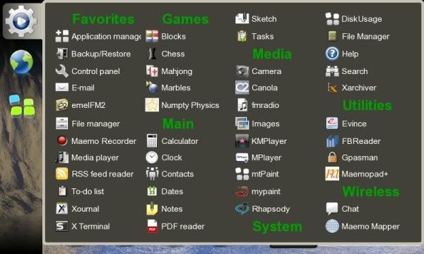
It won't solve all your problems, but Personal Menu will solve some of the issues you speak of (you will still have huge icons).
Can I get rid of the useless and stupid two default contact/web icons?
I could write a better GUI blind drunk with half a bottle of Tequila left. Where's the sources to Nokia's version of Matchbox?
If you have a better GUI, I know I'd like to see it (seriously, I am an old Newton guy, and it was way slow, but had a great UI).
Craig...
__________________
N800, Think Outside Kbd, 8GB SDHC Card (OCZ, ext2), and 8GB SD Card (Patriot formatted as VFAT)
Zaurus SL-6000, IR Keyboard, 1GB SD Card
N800, Think Outside Kbd, 8GB SDHC Card (OCZ, ext2), and 8GB SD Card (Patriot formatted as VFAT)
Zaurus SL-6000, IR Keyboard, 1GB SD Card
|
|
2008-08-25
, 17:54
|
|
Posts: 631 |
Thanked: 1,123 times |
Joined on Sep 2005
@ Helsinki
|
#17
|
Yes, it will be much more finger friendly than the OS2008.
| The Following User Says Thank You to ragnar For This Useful Post: | ||
|
|
2008-08-25
, 18:19
|
|
|
Posts: 3,790 |
Thanked: 5,718 times |
Joined on Mar 2006
@ Vienna, Austria
|
#18
|
bad news. 
after all, the "finger friendliness" was what started this thread IIRC.

after all, the "finger friendliness" was what started this thread IIRC.
|
|
2008-08-25
, 18:26
|
|
|
Posts: 903 |
Thanked: 632 times |
Joined on Apr 2008
|
#19
|
Originally Posted by cvmiller

No big icons here with Personal Menu...
It won't solve all your problems, but Personal Menu will solve some of the issues you speak of (you will still have huge icons).
Craig...

__________________
-Brent
Author of TouchSearch -- web searching software for Maemo 5.
Mobile Device lineage: Palm Z22 -> Palm TX -> Nokia N800 -> Nokia N900
-Brent
Author of TouchSearch -- web searching software for Maemo 5.
Mobile Device lineage: Palm Z22 -> Palm TX -> Nokia N800 -> Nokia N900
|
|
2008-08-25
, 18:39
|
|
|
Posts: 38 |
Thanked: 10 times |
Joined on Mar 2006
|
#20
|
Yes, I wonder why Nokia thinks that a "finger friendly" UI must be "stylus and space unfriendly".
 |
| Tags |
| stuff nokia should read, user interface, whining |
«
Previous Thread
|
Next Thread
»
|
All times are GMT. The time now is 11:56.


For whatever it's worth, it's probably not worth your time hacking in Matchbox as Nokia is moving to X.org for Fremantle, so who knows what might be happening with the WM.
Last edited by GeneralAntilles; 2008-08-25 at 16:57.